YouTube Thumbnail Tips: How to Improve Your CTR in 2026
YouTube thumbnail tips become especially useful when two videos target the same topic but one consistently gets more clicks from the same number of impressions. Your thumbnail is often the first thing you notice before deciding what to watch. A strong design can be the difference between scrolling past a video and clicking it. So instead of chasing a specific CTR percentage, focus on making your thumbnail clear, useful, and interesting enough to earn the click.
What Makes a YouTube Thumbnail Clickable?
A good thumbnail usually comes down to four things: clarity, contrast, curiosity, and one clear idea. Keep it simple. When you try to communicate everything at once, the main message gets lost.
Focus on One Main Idea
Avoid filling the image with multiple messages, screenshots, icons, and blocks of text.
If your video is about increasing YouTube views, the thumbnail could focus on one visual result, such as a rising view graph or a clear before-and-after comparison.
You should be able to understand the basic subject almost instantly. That’s something worth checking yourself before you publish.
Keep Thumbnail Text Short
Thumbnail text should support the visual rather than repeat the entire video title.
Instead of:
HOW TO GET MORE VIEWS ON YOUTUBE IN 2026
Try something shorter:
MORE VIEWS?
or:
WHY NO VIEWS?
Short text is easier to read on mobile devices, where thumbnails appear much smaller. Real talk: if you need to zoom in to read your own thumbnail, there’s probably too much text.
Create Visual Contrast
Your subject should stand out from the background.
Use clear separation between the foreground and background, readable typography, and enough empty space around important elements. You don’t need complicated effects to make something stand out. A clean design can often do the job better.
One thing you’ll notice when comparing thumbnails side by side is how quickly low contrast disappears, especially when the images are viewed at a small size.
Give Viewers a Reason to Be Curious
A thumbnail should answer one question while creating another.
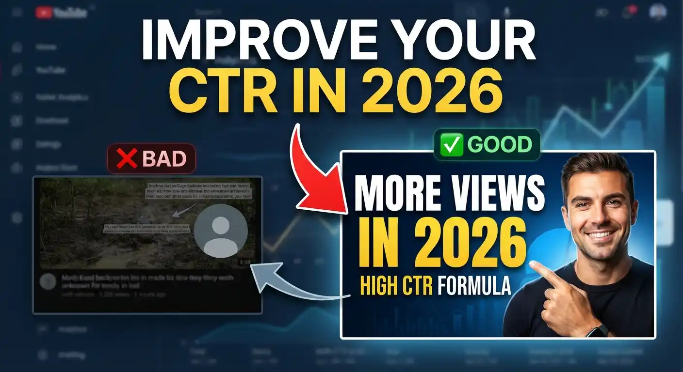
For example, a video about thumbnail mistakes could show a poor thumbnail next to a redesigned version with text such as:
FIX THIS
The viewer immediately understands that something is wrong and has a reason to discover the solution.
Here’s the thing: curiosity works best when it feels natural. You want people wondering about the answer, not wondering why the thumbnail is exaggerating the video.
Match Your Thumbnail With the Video Title
Your thumbnail and title should work as a pair.
If the title says:
How I Increased YouTube Views Without Uploading More Videos
the thumbnail could focus on:
MORE VIEWS
The two elements provide different pieces of information instead of repeating the same sentence.
That gives you more room to communicate the idea without making either element feel crowded.
One common mistake is designing the thumbnail first and then trying to force the title around it. A better approach is to identify the video’s main promise first, then create a thumbnail that visually reinforces that promise.
Common YouTube Thumbnail Mistakes
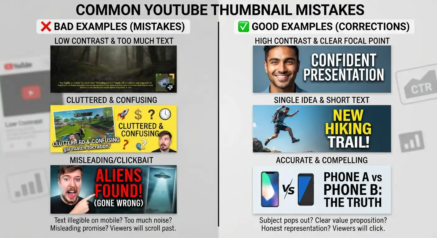
Even technically attractive thumbnails can perform poorly when the message is unclear.
Avoid these problems:
Too much text
Tiny fonts that disappear on mobile
Several competing subjects
Low contrast between text and background
Generic stock images with no clear purpose
Misleading expressions or visual claims
Copying another creator’s design too closely
Making every thumbnail look identical
Using sensational visuals that the video cannot support
A thumbnail can get someone to click, but that click only helps if the video delivers what they expected. If the packaging promises one thing and the content gives them something else, you’ve created a problem for yourself.
How to Test Thumbnails and Improve CTR
Don’t assume the most attractive design will automatically produce the highest CTR.
Create different concepts and compare how viewers respond. Sometimes the simpler version wins. Sometimes a completely different visual direction works better.
For example, you could test:
| Version | Main Approach |
|---|---|
| A | Large face + short text |
| B | Product/result-focused image |
| C | Before-and-after comparison |
| D | Minimal design + curiosity hook |
Keep the topic and overall promise consistent while changing the visual presentation.
You can then evaluate impressions, CTR, views, and watch behavior to understand whether the new thumbnail actually improved performance.
Give the data enough time before deciding that one version is better. CTR can vary depending on traffic source, audience, topic, and where the impression was shown.
From experience, it’s easy to judge a thumbnail too quickly. A design can look great to you and still get a weaker response from your actual audience.
YouTube Thumbnail Tips: A Simple Formula for Better Thumbnails
A practical thumbnail formula is:
Clear subject + strong contrast + short message + curiosity
For example, imagine a video explaining why a channel is not getting views.
A weak thumbnail might contain:
WHY YOUR YOUTUBE CHANNEL IS NOT GETTING VIEWS
A stronger concept could use a simple visual showing a flat analytics graph with:
0 VIEWS?
The second version communicates the problem faster and leaves the detailed explanation for the title and video itself.
Bottom line: don’t try to squeeze the whole video into the thumbnail. Give people enough information to understand the value of clicking, then let the title and video do the rest.
Use the Thumbnail to Communicate the Video’s Payoff
Think about what you’ll actually gain by watching.
Is it a solution?
A transformation?
A comparison?
A surprising result?
A tutorial?
A mistake to avoid?
Your thumbnail can visually represent that payoff.
For a tutorial, show the desired result. For a comparison, visually separate the two options. For a mistake-based video, highlight the problem. For a case study, emphasize the result or change.
Think about your own browsing habits here. You usually don’t stop because a thumbnail contains every detail. You stop because something about it quickly tells you, “This might be useful.”
Final YouTube Thumbnail Checklist
Before publishing, check your design against these questions:
Can I understand the topic in one or two seconds?
Is there one obvious focal point?
Is the text readable on a phone?
Does the thumbnail complement the title?
Does it create curiosity without misleading viewers?
Is the main subject visually separated from the background?
Does the design look different enough from competing videos?
Does the thumbnail accurately represent the video?
If the answer is yes to most of these questions, your thumbnail has a stronger foundation for earning clicks.